Veitch Stainless Steel
UI/UX
Role & Team
Senior Creative Designer. Work with 3 Mid-Weight Designers, Account Director, and Developers.
Project Description
Develop a digital platform for Veitch Stainless, a leading manufacturer of stainless steel products in Australia, that would make it easier for customers to search, view, and purchase products as per their specific requirements.
Problem
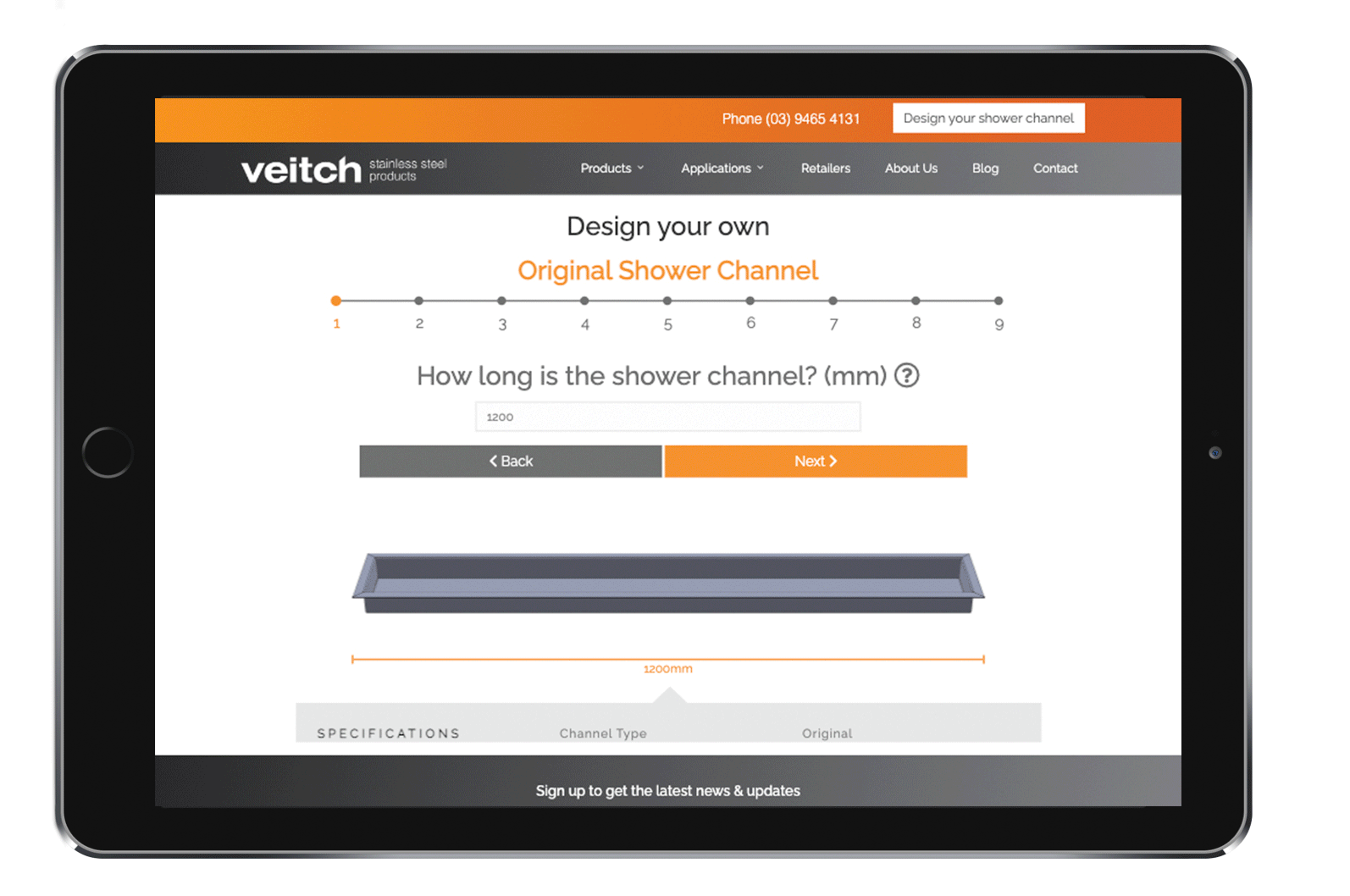
Many users find it difficult to locate the desired product on the current website and feel that the “Design Your Own Shower Channel” process is too lengthy, leading to a loss of interest mid-way.
Objective
-
Develop a user-friendly website that makes it easy for customers to search and view products.
-
Enable customers to find products suitable for different industries or applications.
-
Provide customers with the ability to create and save custom product.
-
Highlight Veitch’s “Made to Measure” service by showcasing clear visuals and specifications of customized products.
-
Incorporate a product filtering system to help customers find products quickly.
-
To simplify and present technical data in an accessible format.
Technology Used
Miro, WordPress, Illustrator, Photoshop, InDesign,
__________
Empathy map

Site Map
Wireframe
To help us plan the structure and layout of our website, we created a site map.
Our main menu will have two different catalogs, and the site map provides a visual representation of how these catalogs and other pages on our site will be organized and connected.
By creating the site map early in our design process, team and Veitch will have a clearer understanding of how the final product will appear, and we can make any necessary edits before moving on to wireframe and high-fidelity design.
During the site map stage, we also come with some UI/UX ideas, for example, we determined the number of steps and content required for the "Design Your Own Product" feature, which helped us create the stepper section.


UI/UX Design

Colour scheme
In this project, orange and grey serve as the main colors to communicate the brand and product respectively.
Orange is used to represent the brand and create a trustable and energetic atmosphere, while grey provides a neutral and professional background for the product (stainless steel).
The combination of these two colors creates a balanced and visually appealing look, while also communicating the brand’s values and personality.

Usability
Stepper: To enhance user experience, we integrated a stepper into the design to clearly display the progress of the process, aims to enhance user engagement and improve the overall user experience.
Button: The design of the Back and Next buttons incorporates the two primary color themes of the website, striking a balance between highlighting the Next button and maintaining the color of the Back button. The presence of an arrow icon next to the text provides an instinctual cue to the user, promoting an intuitive user experience.
Diagram: real time update
Drop down menu: Incorporates images for each group to enhance visual accessibility. The inclusion of a hover scale animation for each group adds a visually dynamic touch to the site, preventing visual fatigue in a technically heavy environment.
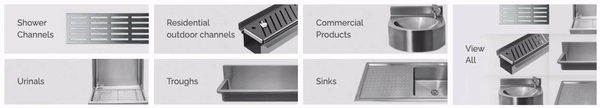
2 Primary catalogues:
In order to cater to the diverse needs of our users, we create two primary catalogues - product and application.
Groups: Each catalogues have been divided into six groups based on their highest utilization rate, providing a clear and organized navigation structure.
Colour scheme: strictly adheres to our color plan on each devices, ensuring a consistent and cohesive experience for the user.


Information Architecture
Layout on variant device:
desktop & tablet - our technical data is presented using tabs to create a hierarchy of the user flow, which is: Product description > Product images > Technical data > Download (Warranty).
Tabs default to an unexpanded state for clarity on mobile, prioritizing information readability and accessibility for a seamless cross-device experience.
Breadcrumb:
The breadcrumb navigation provides users with the ability to easily navigate back to previous pages or visit other catalogs based on the current product they are viewing. The hierarchy of the breadcrumb is determined by the site map that was established during the early stages of our design process.
High Fi Design